
Slipcase Platform-Wide Redesign
I initially pitched this project to the team when I first joined Slipcase, the content platform distributing information for the risk & (re)insurance industry. The new look and feel of the platform aimed to bring forward the customisation aspect of our services back to the forefront, as this is something I felt had gotten lost in the previous design. This was readily taken on, and I was able to begin designing the mockups for the desktop platform, mobile app and tablet feeds.

Previous Slipcase desktop feed

New Slipcase desktop feed
The new feed is inspired by LinkedIn’s look, feel and functionalities. The main page has shifted from the recommended feed to the personalised feed, with recommended articles at the top to still maintain a good level of visibility. The priority here was to bring the personal, curated aspect of the platform forward more, as well as to improve the user experience overall. This is why we have put the company name and logo visible, as opposed to just the company logo, in order to generate more brand awareness.
In addition to these changes, we have also rounded the corners of the tiles and buttons, just to give a modernised look and feel to the platform in general. There are also more functionalities available, including filters and enhanced search options, which will help the user experience become much easier moving forward.

Previous Slipcase tablet feed

New Slipcase tablet feed

Previous Slipcase mobile feed
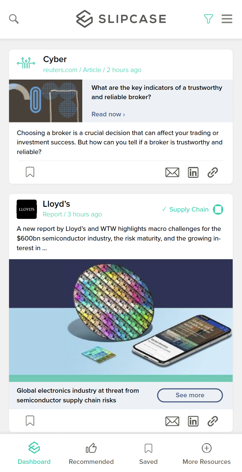
New Slipcase mobile feed